font choices
|
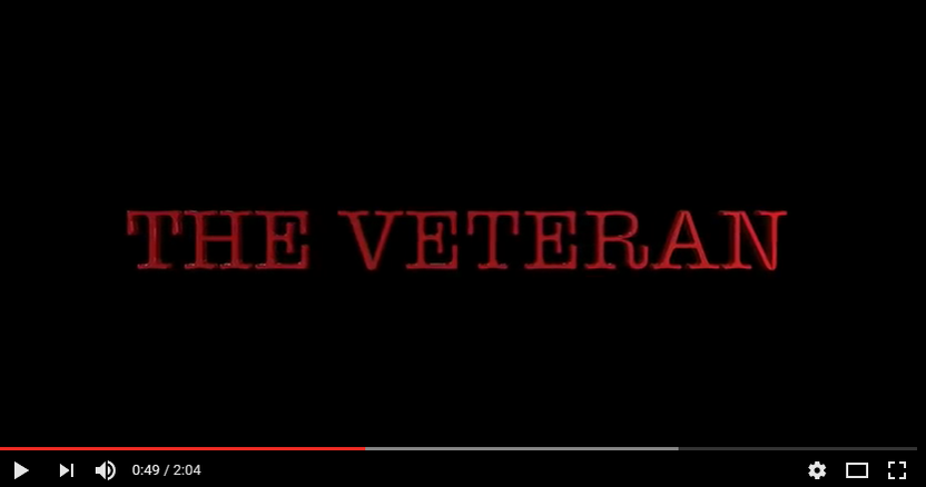
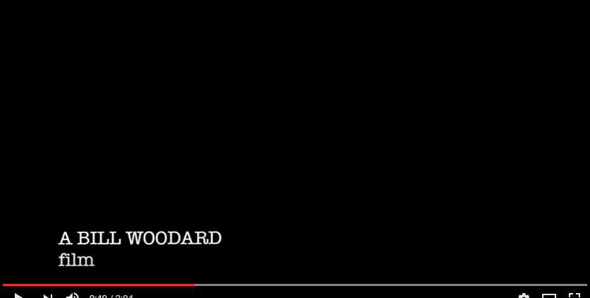
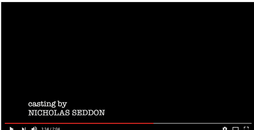
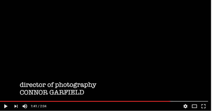
The font used for the title and credits was American Typewriter and can be found on the Final Cut app on the Macs. We felt that it had an eerie touch to the OTS and contributed to the horror of it. It also relates to the Veteran theme where it is classed as classic or old.
|
We decided to make the title red to symbolise blood and danger, which is easy to recognise in our OTS.
We made the credits white to represent the purity of the victim and we felt that it juxtaposes the red title. |
|
|
